Chapter 3 From People to Built Environment
So far, we have focused on embedding demographic data into places. However, sociological questions extend beyond just understanding people in places. People don’t simply exist in locations—they interact with the built environment, including schools, local businesses, landmarks, and more. In GIS terms, this type of data is known as point-of-interest (POI) data, which refers to specific points or useful sites identified by geographic coordinates (latitude and longitude). In this tutorial, we will use Airbnb listings and local business data as examples of point-of-interest data.
3.1 Transforming Airbnbs
When data contains latitude and longitude coordinates, we can transform it into an sf object by using the st_as_sf command. Here, we’ll use San Francisco Airbnb data to illustrate this process. Unlike neighborhood boundaries, which have polygon geometries, POIs will have point geometries.
# Import the Airbnb data
sfbnb <- read.csv("data/sfbnb.csv")

head(sfbnb, 3)
## id trt10 analysis latitude longitude property_type review_scores_rating
## 1 958 16700 haight ashbury 37.76931 -122.4339 Apartment 97
## 2 5858 25300 bernal heights 37.74511 -122.4210 Apartment 98
## 3 7918 17102 haight ashbury 37.76669 -122.4525 Apartment 85
## review_scores_location number_of_reviews
## 1 10 176
## 2 10 111
## 3 9 17# Transform lat/long into sf object
sf_sfbnb <- st_as_sf(sfbnb,
coords = c("longitude", "latitude"),
crs = 4326 # specify the projection; WGS84 is a standard projection for global mapping.
)
# Check the data
head(sf_sfbnb, 3)## Simple feature collection with 3 features and 7 fields
## Geometry type: POINT
## Dimension: XY
## Bounding box: xmin: -122.4525 ymin: 37.74511 xmax: -122.421 ymax: 37.76931
## Geodetic CRS: WGS 84
## id trt10 analysis property_type review_scores_rating review_scores_location
## 1 958 16700 haight ashbury Apartment 97 10
## 2 5858 25300 bernal heights Apartment 98 10
## 3 7918 17102 haight ashbury Apartment 85 9
## number_of_reviews geometry
## 1 176 POINT (-122.4339 37.76931)
## 2 111 POINT (-122.421 37.74511)
## 3 17 POINT (-122.4525 37.76669)You can see that geometry is points, rather than polygons. Each point represents an Airbnb property (id- unique identifier). It also indicates the census tract (trt10) and neighborhood name (analysis) in which the Airbnb property is located. The data also contains attributes of the Airbnb property, such as property type, review score ratings, and the number of reviews.
You can save the converted file as geojson using the “st_write” command.
# Export the Airbnb data as a geojson file
st_write(sf_sfbnb, "processed-data/airbnbs.geojson", driver = "GeoJSON", delete_dsn = TRUE)
3.2 Geocoding Restaurants
Sometimes, your data may lack latitude and longitude information. Instead, the data may contain street addresses. In such cases, we need to perform geocoding which converts formatted addresses into latitude and longitude coordinates, allowing the data to be displayed as points on a map. Below, we will demonstrate the geocoding process using the restaurant data in San Francisco.
# Import restaurant data
sfbiz <- read.csv("data/sfbiz_clean.csv")

# Check if lat and lon exists
head(sfbiz, 3)
## company address_line_1 city zipcode
## 1 JOHN'S GRILL 63 ELLIS ST SAN FRANCISCO 94102
## 2 TAD'S STEAKHOUSE 120 POWELL ST SAN FRANCISCO 94102
## 3 SAM'S GRILL & SEA FOOD RSTRNT 374 BUSH ST SAN FRANCISCO 94104
## naics8_descriptions employee_size_location sales_volume_location state
## 1 FULL-SERVICE RESTAURANTS 20 1424 CA
## 2 FULL-SERVICE RESTAURANTS 19 1353 CA
## 3 FULL-SERVICE RESTAURANTS 35 2491 CAIn this data, we can see that latitude and longitude coordinates do not exist. However, it contains information on street address, city, state, and zip code. To carry out geocoding, first, we have to create a field that displays a full address. Based on the full address, we can get the coordinates via open street map (osm). Once the data is geocoded, we can transform this data frame to sf object for mapping.
# Set up
library(tidygeocoder)

# Create a full address field (street address, city, state, zipcode)
sfbiz <- sfbiz %>%
  mutate(full_add = paste(address_line_1, city, state, zipcode, sep = ", "))

# Geocode the full address
geocoded_sfbiz <- sfbiz %>%
  sample_n(5) %>% # the full data can take a while, so let's try on a smaller sample
  geocode(address = full_add, method = 'osm')

# Check the geocoded data
geocoded_sfbiz %>%
  dplyr::select(lat, long)
## # A tibble: 5 × 2
## lat long
## <dbl> <dbl>
## 1 37.8 -122.
## 2 37.8 -122.
## 3 37.8 -122.
## 4 37.8 -122.
## 5 37.8 -122.# For the purpose of this tutorial, we can use the prepared, full geocoded data
prep_sfbiz <- read.csv("data/geocoded_sfbiz_clean.csv")
# Transform lat/long data into sf oject
sf_sfbiz <- st_as_sf(prep_sfbiz,
coords = c("long", "lat"),
crs = 4326)
head(sf_sfbiz, 5)## Simple feature collection with 5 features and 9 fields
## Geometry type: POINT
## Dimension: XY
## Bounding box: xmin: -122.4078 ymin: 37.78546 xmax: -122.4037 ymax: 37.79137
## Geodetic CRS: WGS 84
## company address_line_1 city zipcode
## 1 JOHN'S GRILL 63 ELLIS ST SAN FRANCISCO 94102
## 2 TAD'S STEAKHOUSE 120 POWELL ST SAN FRANCISCO 94102
## 3 SAM'S GRILL & SEA FOOD RSTRNT 374 BUSH ST SAN FRANCISCO 94104
## 4 B44 CATALAN BISTRO 44 BELDEN PL SAN FRANCISCO 94104
## 5 MIKAKU RESTAURANT 323 GRANT AVE SAN FRANCISCO 94108
## naics8_descriptions employee_size_location sales_volume_location state
## 1 FULL-SERVICE RESTAURANTS 20 1424 CA
## 2 FULL-SERVICE RESTAURANTS 19 1353 CA
## 3 FULL-SERVICE RESTAURANTS 35 2491 CA
## 4 FULL-SERVICE RESTAURANTS 23 1637 CA
## 5 FULL-SERVICE RESTAURANTS 9 641 CA
## full_add geometry
## 1 63 ELLIS ST, SAN FRANCISCO, CA, 94102 POINT (-122.4072 37.78546)
## 2 120 POWELL ST, SAN FRANCISCO, CA, 94102 POINT (-122.4078 37.78596)
## 3 374 BUSH ST, SAN FRANCISCO, CA, 94104 POINT (-122.4037 37.79095)
## 4 44 BELDEN PL, SAN FRANCISCO, CA, 94104 POINT (-122.4037 37.79137)
## 5 323 GRANT AVE, SAN FRANCISCO, CA, 94108 POINT (-122.4057 37.78999)# Export the restaurant data as a geojson file
st_write(sf_sfbiz, "processed-data/restaurants.geojson", driver = "GeoJSON", delete_dsn = TRUE)3.3 Distribution and density
Now that we have restaurant locations as points, we can simply overlay the restaurant locations on top of the neighborhood boundaries layer to explore the geographical distribution of restaurants.
# Plot the restaurant locations
ggplot() +
  # display neighborhood boundaries as a layer
  geom_sf(data = sfnh,
          fill = "lightgray",
          size = 0.02,
          color = "white"
          ) +
  # add restaurants as another layer
  geom_sf(data = sf_sfbiz,
          color = "red",
          size = 0.5,
          alpha = 0.8       # set transparency
          ) +
  theme_void() +
  labs(title = "Restaurants in San Francisco")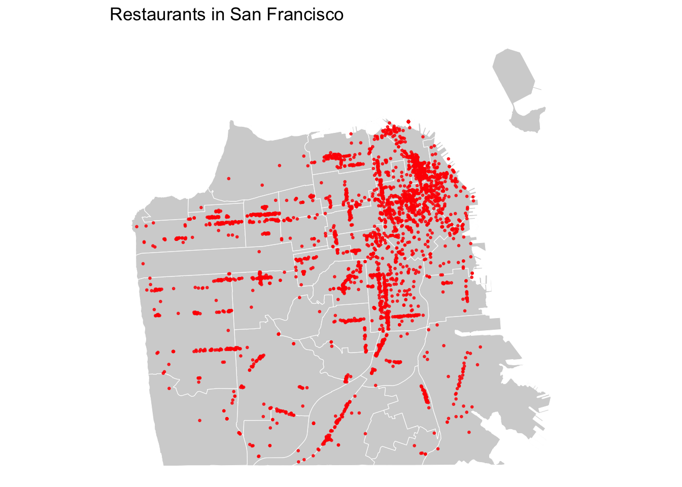
SYMBOLOGY BASED ON ATTRIBUTES
You can differentiate points based on attributes using symbology (e.g., colors, shapes, sizes). Here, we are only looking at restaurants. But imagine you have a dataset that contains multiple types of retail, such as bars, coffee shops, and restaurants. You might want to map the overall distribution of businesses, but also focus on one specific type of business or highlight differences by business type.
In our data, we have “employee size” and “sales volume” of restaurants as attributes. Let’s say you want to focus on small, mom and pop businesses and explore where these small restaurants are concentrated. In the US, businesses with less than 10 or 5 employees are often considered as “small”. Here, we will use 5 as a cutoff to define a small restaurant. You can highlight your data based on this specific attribute.
# Create a new column based on employee size
sf_sfbiz$small <- ifelse(sf_sfbiz$employee_size_location < 5, "small", "non-small")

# Plot with ggplot
ggplot() +
  # display neighborhood boundaries as a layer
  geom_sf(data = sfnh,
          fill = "lightgray",
          size = 0.02,
          color = "white"
          ) +
  # add restaurants as another layer
  geom_sf(data = sf_sfbiz,
          aes(color = small), # specify the color based on "small" variable
          size = 0.5, alpha = 0.8
          ) +
  scale_color_manual(values = c("small" = "red", "non-small" = "black"), # specify colors
                     labels = c("small" = "less than 5",
                                "non-small" = "5 or more")
                                ) +           # set labels
  theme_void() +
  labs(title = "Restaurants by Employee Size in San Francisco",
       color = "Employee Size")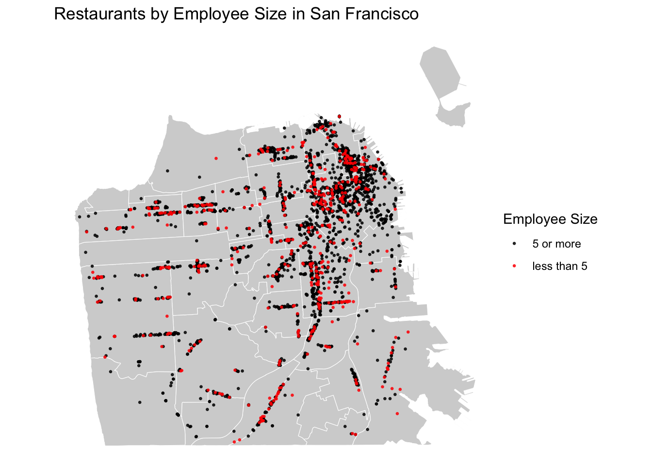
# Add more symbology details
ggplot() +
  # display neighborhood boundaries as a layer
  geom_sf(data = sfnh,
          fill = "lightgray",
          size = 0.02,
          color = "white"
          ) +
  # add restaurants as another layer
  geom_sf(data = sf_sfbiz,
          aes(color = small,
              shape = small,
              size = small),
          alpha = 0.8) +
  scale_color_manual(values = c("small" = "red", "non-small" = "black")) +
  scale_shape_manual(values = c("small" = 23, "non-small" = 16),
                     labels = c("small" = "less than 5",
                                "non-small" = "5 or more")) +
  scale_size_manual(values = c("small" = 1.5, "non-small" = 0.5)) +
  guides(color = "none",
         size = "none",
         shape = guide_legend(override.aes = list(
           color = c("red", "black"),
           size = c(1.5, 0.5),
           shape = c(23, 16)
           ))) +
  theme_void() +
  labs(title = "Restaurants by Employee Size in San Francisco",
       shape = "Employee Size")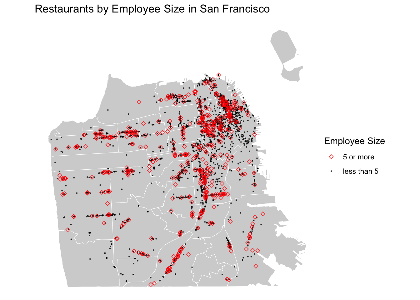
From point maps, we can get a general sense of the distribution of restaurants in San Francisco. However, there are two limitations to this visualization. First, it is hard to tell exactly where restaurants are more or less concentrated because points overlap where densely populated. To draw attention to where points are concentrated the most, we can use a density map (also known as a heat map). Among various methods for creating a density map, we will learn how to create a density map using kernel density estimation (KDE). This function is available through the “MASS” package.
# Install and set up the "MASS" package
library("MASS")

# Extract coordinates from the sf object
coords <- st_coordinates(sf_sfbiz)

# Calculate KDE based on coordinates
kde <- kde2d(coords[, 1], coords[, 2], n = 500) # n specifies the number of grids

# Convert KDE to raster format
kde_df <- expand.grid(x = kde$x, y = kde$y)
kde_df$z <- as.vector(kde$z)

head(kde_df, 5)
## x y z
## 1 -122.5128 37.70935 3.610331e-06
## 2 -122.5125 37.70935 4.248448e-06
## 3 -122.5123 37.70935 5.002065e-06
## 4 -122.5120 37.70935 5.893135e-06
## 5 -122.5117 37.70935 6.947927e-06# Plot KDE heat map
ggplot() +
geom_raster(data = kde_df,
aes(x = x, y = y, fill = z),
alpha = 1) + # Kernel density heat map
geom_sf(data = sfnh, fill = NA, color = "black") + # Neighborhood boundaries
scale_fill_gradientn(colors = c("transparent", "lightpink", "red", "darkred"), name = "Density") +
theme_void() +
labs(title = "Heat Map of Restaurants in San Francisco")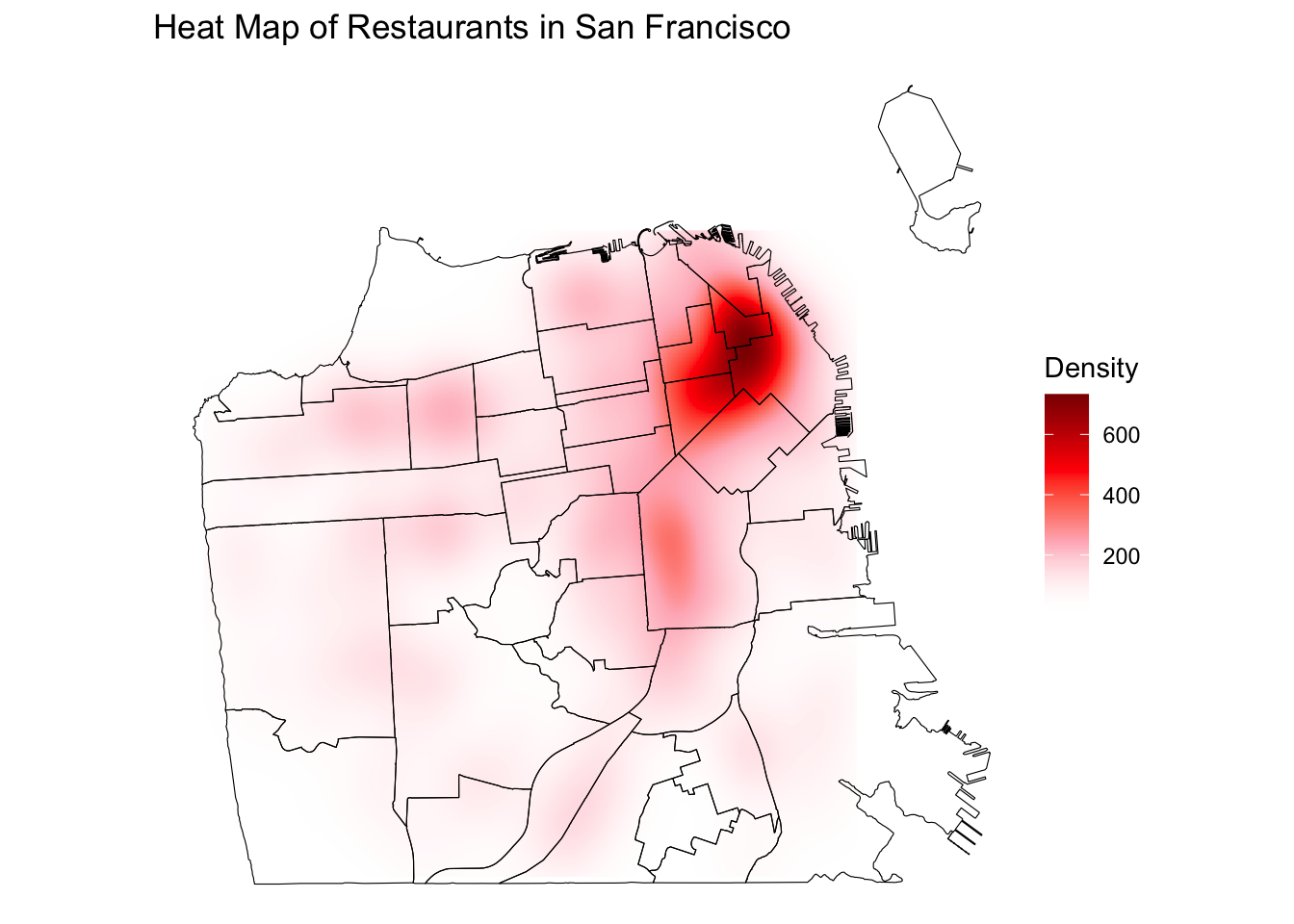
Now, you can clearly see where the restaurants are most concentrated!
While heat maps are useful for clearly visualizing concentration of restaurants, the second limitation still remains. With points data, it is difficult to discern spatial patterns of restaurants by neighborhoods because restaurants are both in and outside of neighborhood boundaries. To solve this problem, we will discuss spatial join in the following section, which allows us to spatially link restaurants to neighborhoods, so that we can reduce points data to the level of neighborhoods.
CODING EXERCISE
- Create a point map using symbology
- Use the sales volume variable to create a new category
- Try using different colors, shapes, and sizes to represent your data
3.4 Spatial join
Spatial join allows you to combine two sf objects based on the spatial relationship between their geometries. For example, we can think of the relationship between neighborhoods (polygons) and restaurants (points).
- Neighborhoods (x) contain restaurants (y), or
- restaurants (x) are within neighborhoods (y).
# Before joining, check if they have the same projections
st_crs(sfnh) == st_crs(sf_sfbiz)
## [1] TRUE# Perform spatial join
nh_joined <- st_join(x = sfnh, # join
y = sf_sfbiz, # target
join = st_contains, # does x(polygon) contains y(point)?
left = TRUE) # keep all neighborhoods
# Explore
head(nh_joined, 3)## Simple feature collection with 3 features and 11 fields
## Geometry type: MULTIPOLYGON
## Dimension: XY
## Bounding box: xmin: -122.4428 ymin: 37.77644 xmax: -122.4202 ymax: 37.79037
## Geodetic CRS: WGS 84
## nhood company address_line_1 city zipcode
## 1 Western Addition HINATA SUSHI 810 VAN NESS AVE SAN FRANCISCO 94109
## 1.1 Western Addition BURGER KING 819 VAN NESS AVE SAN FRANCISCO 94109
## 1.2 Western Addition ISTITUTO ITALIANO DI CULTURA 601 VAN NESS AVE # F SAN FRANCISCO 94102
## naics8_descriptions employee_size_location sales_volume_location state
## 1 FULL-SERVICE RESTAURANTS 6 427 CA
## 1.1 FULL-SERVICE RESTAURANTS 58 2447 CA
## 1.2 FULL-SERVICE RESTAURANTS 6 427 CA
## full_add small geometry
## 1 810 VAN NESS AVE, SAN FRANCISCO, CA, 94109 non-small MULTIPOLYGON (((-122.4214 3...
## 1.1 819 VAN NESS AVE, SAN FRANCISCO, CA, 94109 non-small MULTIPOLYGON (((-122.4214 3...
## 1.2 601 VAN NESS AVE # F, SAN FRANCISCO, CA, 94102 non-small MULTIPOLYGON (((-122.4214 3...In the joined data, we can see that restaurants (company) are nested within neighborhoods (nhood). We can aggregate this data to the neighborhood level and get the number of restaurants per neighborhood. Some neighborhoods may not any have restaurants, so you want to preserve that as 0 and not count as 1.
# Count restaurants per neighborhood
restaurant_counts <- nh_joined %>%
  st_drop_geometry() %>%
  group_by(nhood) %>%
  summarise(n_rst = sum(!is.na(company))) # don't count NA as 1

head(restaurant_counts, 10)
## # A tibble: 10 × 2
## nhood n_rst
## <chr> <int>
## 1 Bayview Hunters Point 42
## 2 Bernal Heights 73
## 3 Castro/Upper Market 86
## 4 Chinatown 174
## 5 Excelsior 48
## 6 Financial District/South Beach 280
## 7 Glen Park 12
## 8 Golden Gate Park 2
## 9 Haight Ashbury 45
## 10 Hayes Valley 98MAPPING AGGREGATED RESTAURANT COUNTS
As the count of restaurants is a quantitative variable, we can visualize it using the choropleth map. I first join the restaurant counts data with neighborhood boundaries to get the neighborhood-level spatial data. Then, I create a map using custom breaks based on the distribution of the number of restaurants within a neighborhood.
# Join the restaurant count to neighborhood boundaries
biz_colors <- sfnh %>%
  left_join(restaurant_counts,
            by = "nhood")

head(biz_colors, 3)
## Simple feature collection with 3 features and 2 fields
## Geometry type: MULTIPOLYGON
## Dimension: XY
## Bounding box: xmin: -122.4761 ymin: 37.70833 xmax: -122.3983 ymax: 37.79037
## Geodetic CRS: WGS 84
## nhood n_rst geometry
## 1 Western Addition 45 MULTIPOLYGON (((-122.4214 3...
## 2 West of Twin Peaks 74 MULTIPOLYGON (((-122.461 37...
## 3 Visitacion Valley 6 MULTIPOLYGON (((-122.4039 3...hist(biz_colors$n_rst)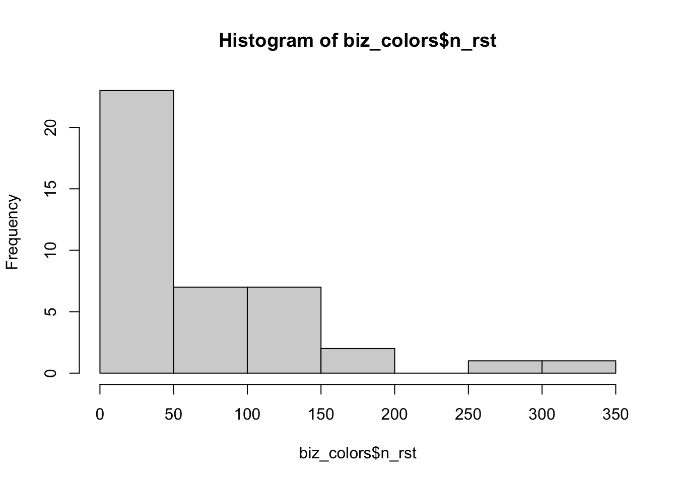
st_write(biz_colors, "processed-data/agg_restaurants.geojson", driver = "GeoJSON", delete_dsn = TRUE)## Deleting source `processed-data/agg_restaurants.geojson' using driver `GeoJSON'
## Writing layer `agg_restaurants' to data source
## `processed-data/agg_restaurants.geojson' using driver `GeoJSON'
## Writing 41 features with 2 fields and geometry type Multi Polygon.# Create the map using custom breaks
ggplot() +
geom_sf(data = biz_colors,
aes(fill = n_rst),
size = 0.2,
color = "white") +
scale_fill_distiller(type="seq",
palette = "Greys",
breaks = c(50, 150, 250), # specify custom breaks
direction = 1,
) +
theme_void() +
labs(fill = "Restaurant Count",
title = "Choropleth Map of Restaurants in San Francisco")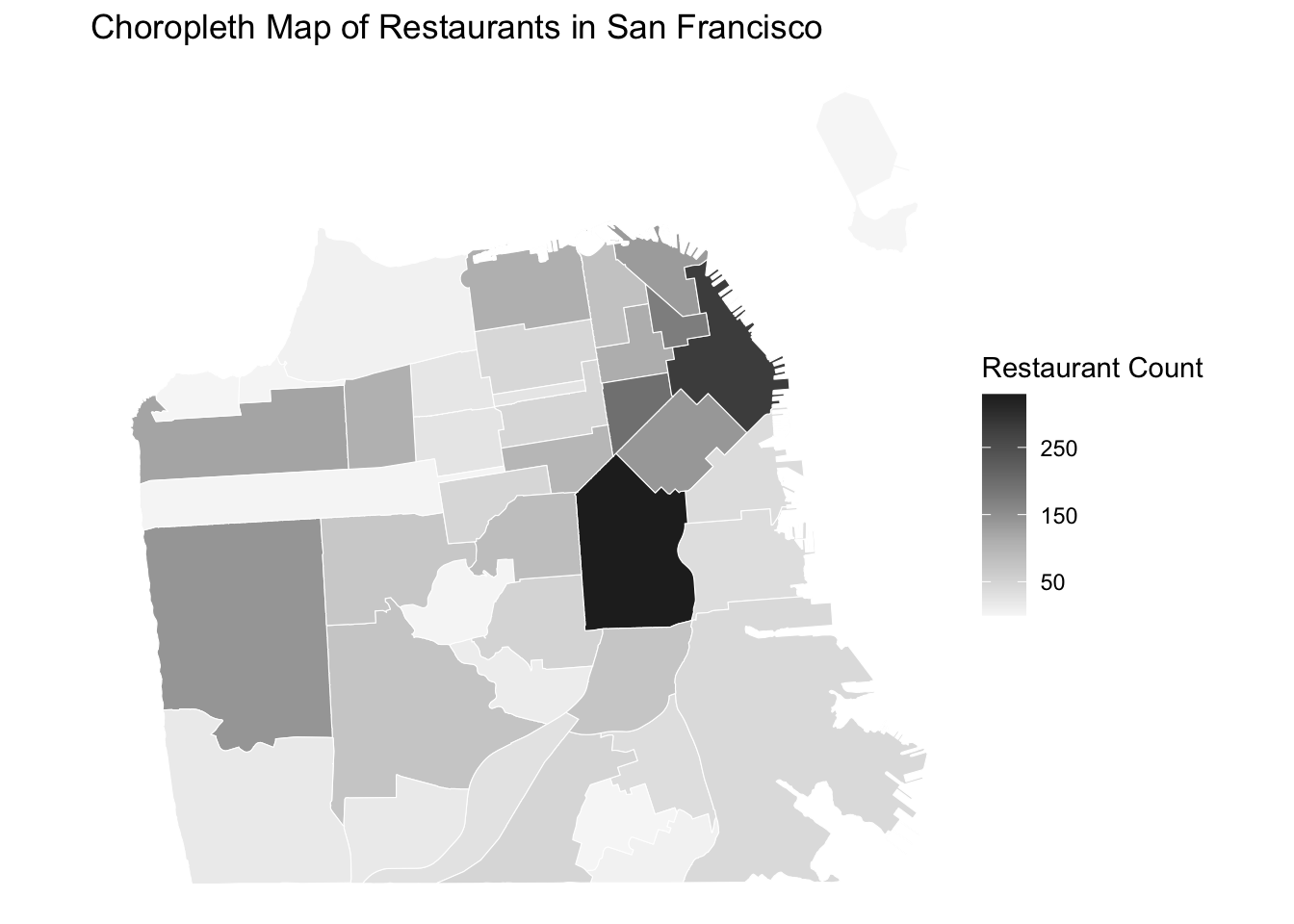
Another way of visualizing a quantitative variable is a proportional symbol map. Proportional symbol maps are particularly useful for absolute quantitative variables (e.g., raw counts, measurements) while choropleth maps are more suitable for relative quantitative variables (e.g., ratios, percentages, proportions).
# Create neighborhood centroids
nh_cent <- st_centroid(sfnh)

# Check centroids
print(nh_cent)
## Simple feature collection with 41 features and 1 field
## Geometry type: POINT
## Dimension: XY
## Bounding box: xmin: -122.5014 ymin: 37.71287 xmax: -122.3695 ymax: 37.82065
## Geodetic CRS: WGS 84
## First 10 features:
## nhood geometry
## 1 Western Addition POINT (-122.4306 37.78183)
## 2 West of Twin Peaks POINT (-122.4599 37.73518)
## 3 Visitacion Valley POINT (-122.4101 37.71287)
## 4 Twin Peaks POINT (-122.4498 37.75211)
## 5 South of Market POINT (-122.4059 37.77725)
## 6 Treasure Island POINT (-122.3695 37.82065)
## 7 Presidio Heights POINT (-122.4517 37.78631)
## 8 Presidio POINT (-122.4664 37.79738)
## 9 Potrero Hill POINT (-122.3936 37.75887)
## 10 Portola POINT (-122.409 37.72679)# Join the restaurant counts to neighborhood centroids
biz_symbols <- nh_cent %>%
left_join(restaurant_counts, by = "nhood") %>%
arrange(desc(n_rst)) # sort to ensure small points would be plotted in front of big points
head(biz_symbols, 3)## Simple feature collection with 3 features and 2 fields
## Geometry type: POINT
## Dimension: XY
## Bounding box: xmin: -122.4155 ymin: 37.76013 xmax: -122.3971 ymax: 37.79042
## Geodetic CRS: WGS 84
## nhood n_rst geometry
## 1 Mission 329 POINT (-122.4155 37.76013)
## 2 Financial District/South Beach 280 POINT (-122.3971 37.79042)
## 3 Tenderloin 196 POINT (-122.4153 37.78316)# Create the proportional symbol map
ggplot() +
geom_sf(data = sfnh, # add a base map layer of boundaries
fill = "lightgray",
size = 0.02,
color = "white"
) +
geom_sf(data = biz_symbols,
aes(size = n_rst), # add a layer of symbols sized based on the restaurant counts
shape = 21, # specify a circle shape for symbols
fill = "red", # set a color to fill the shape
alpha = 0.6, # set a level of transparency
color = "lightgray") + # set a color for edges of the shape
scale_size(range = c(3, 13)) + # set min and max for the size of the symbols
theme_void() +
labs(size = "Restaurant Count",
title = "Proportional Symbol Map of Restaurants in San Francisco") 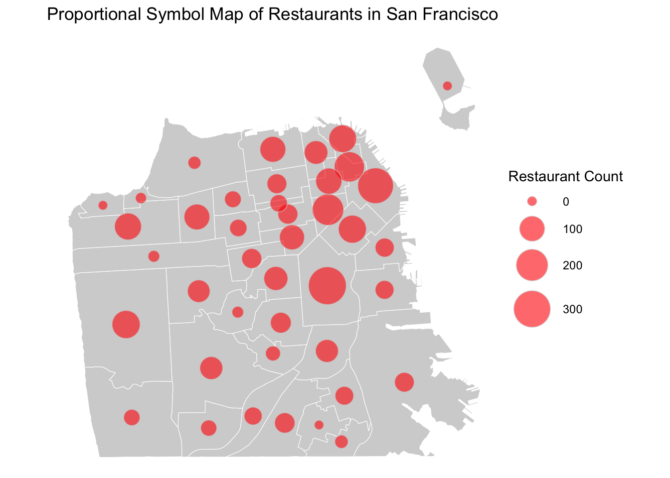
A proportional symbol map is also called a clustered point map. In this map, the symbol sizes correspond with the frequency of restaurants - the larger the symbol, the more restaurants that are present in that area. This type of clustering and aggregating visualization technique is particularly helpful when your data only have approximate locations. You can combine two types of aggregated into one visualization by specifying both symbol sizes and colors.
# Create the proportional symbol map (size) combined with the choropleth map (fill color)
ggplot() +
  geom_sf(data = sfnh,
          fill = "lightgray",
          size = 0.02,
          color = "white"
          ) +
  geom_sf(data = biz_symbols,
          aes(size = n_rst, fill = n_rst),
          shape = 21,
          color = "lightgray") +
  scale_size(range = c(3, 10)) +
  # add colors to the symbols
  scale_fill_gradientn(colors = hcl.colors(4,                   # fill the shape with four different colors
                                           "RdBu",              # red-blue color scheme
                                           rev = TRUE,          # reverse the color scheme
                                           alpha = 0.9)) +      # transparency
  theme_void() +
  guides(fill = guide_legend(title = "Restaurant Count"),
         size = guide_legend(title = "Restaurant Count")) +     # combine legends
  labs(title = "Choropleth/Proportional Symbol Map of Restaurants in San Francisco")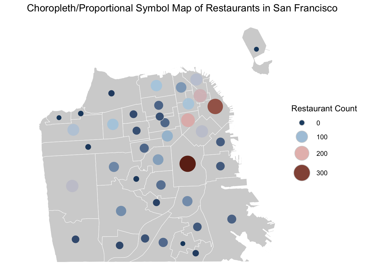
3.5 Export Maps
Now, let’s say you are ready export your maps for publication. We will publish a figure of four maps combined, displaying various ways of visualizing the distribution of restaurant by neighborhood in San Francisco.
# Store and combine maps
map1 <- ggplot() +
  geom_sf(data = sfnh,
          fill = "lightgray",
          size = 0.02,
          color = "white"
          ) +
  geom_sf(data = sf_sfbiz,
          color = "red",
          size = 0.5, alpha = 0.8
          ) +
  theme_void()

map2 <- ggplot() +
  geom_raster(data = kde_df,
              aes(x = x, y = y, fill = z),
              alpha = 1) +
  geom_sf(data = sfnh, fill = NA, color = "black") +
  scale_fill_gradientn(colors = c("transparent", "lightpink", "red", "darkred"), name = "Density") +
  theme_void() +
  theme(legend.position = "none")

map3 <- ggplot() +
  geom_sf(data = biz_colors,
          aes(fill = n_rst),
          size = 0.2,
          color = "white") +
  scale_fill_distiller(type="seq",
                       palette = "Greys",
                       breaks = c(50, 150, 250),
                       direction = 1,
                       ) +
  theme_void() +
  theme(legend.position = "none")

map4 <- ggplot() +
  geom_sf(data = sfnh,
          fill = "lightgray",
          size = 0.02,
          color = "white"
          ) +
  geom_sf(data = biz_symbols,
          aes(size = n_rst),
          shape = 21,
          fill = "red",
          alpha = 0.6,
          color = "lightgray") +
  scale_size(range = c(3, 13)) +
  theme_void() +
  theme(legend.position = "none")

combined <- ggpubr::ggarrange(map1, map2, map3, map4, nrow=2, ncol=2,
                  labels = c("Point Map", "Heat Map", "Choropleth Map", "PropSymbol Map"))

print(combined)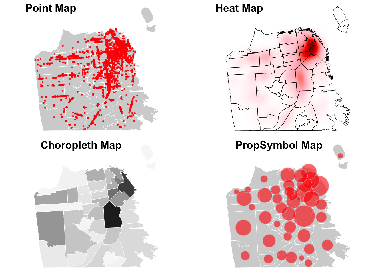
# Export the combined map
ggsave("sf_restaurant_maps.png", plot = combined,
       width = 9, height = 9,
       dpi = 300 # resolution
       )
THINK AND SHARE
Discuss similarities and differences across four different types of maps. What are pros and cons of each type of map? Which visualization do you think is most effective and why?
LEARN MORE
While it is not strictly expected in sociology papers, you can also add a north arrow and a scale bar to a map using the ggspatial package.
library(ggspatial)# Adding a scale bar and a north arrow
ggplot() +
geom_sf(data = biz_colors,
aes(fill = n_rst),
size = 0.2,
color = "white") +
scale_fill_distiller(type = "seq",
palette = "Greys",
breaks = c(50, 150, 250),
direction = 1) +
theme_void() +
labs(fill = "Restaurant Count",
title = "Distribution of Restaurants in San Francisco") +
# add a scale bar
annotation_scale(location = "bl", # "br" is for bottom right, adjust as needed
pad_y = unit(0.01, "cm") # place the scale bar close to the bottom
) +
# add a north arrow
annotation_north_arrow(location = "tl", # "tl" is for top left, adjust as needed
style = north_arrow_fancy_orienteering) ![]()